
When designing a billboard, keep three words in mind:
1. Keep it simple – Less is more on a billboard.
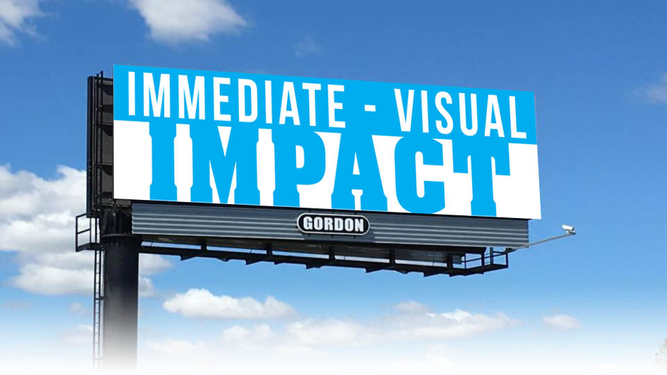
A few well-chosen words are all it takes to get your concept noticed – and remembered.
5 words or less is an industry rule of thumb.
2. Avoid ornate typefaces.
Elaborate or decorative type (font) can make your message difficult to read. Use BOLD simple fonts.
3. Contrast is King.
Contrast is the most important aspect when choosing colors and images.
The more contrast between the text, images and background the better.
File Formats for LED Digital displays:
Jpeg files are the preferred file format. All colors RGB.
File Formats for static displays which use vinyl:
Art should be created at a scale of 1/2 inch equals 1 foot at 300ppi.
High Quality PDF files are the preferred final art format.
Questions or artwork files can be emailed to: brianfirth(at sign)gordonoutdoor.com